By Charmean Neithart: Houzz
Contributor. I love interior design and all things houses. It has been
my great privilege to create spaces over the last eleven years to a
varied and loyal clientele
You never know when you might need to pump up your vocabulary. With
the holidays fast approaching, you might soon find yourself in a
friendly game of Scrabble or having cocktail conversation at some swanky
party. Why not impress your friends and random strangers with extensive
color knowledge?
In my work week, I get introduced to colors that I have never heard of fairly regularly. I like to learn about them because there is usually some history lesson involved, and it helps me to understand the undertones of color. For example, there are hundreds of shades of blue. If a blue fabric is described as smalt, I would know exactly what to expect even without a visual. Here are some colors you probably have never heard of but will love to get to know.
In my work week, I get introduced to colors that I have never heard of fairly regularly. I like to learn about them because there is usually some history lesson involved, and it helps me to understand the undertones of color. For example, there are hundreds of shades of blue. If a blue fabric is described as smalt, I would know exactly what to expect even without a visual. Here are some colors you probably have never heard of but will love to get to know.
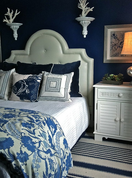
Smalt is a deep blue
pigment typically used in ceramics. Smalt is a glass that is created
when cobalt salts are added to molten glass. It has a very subtle
purple undertone but is better described as a pure blue. Much like
cobalt, it has a luminescent quality, making it look backlit. This wall
is a good example.
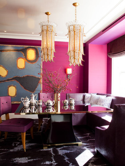
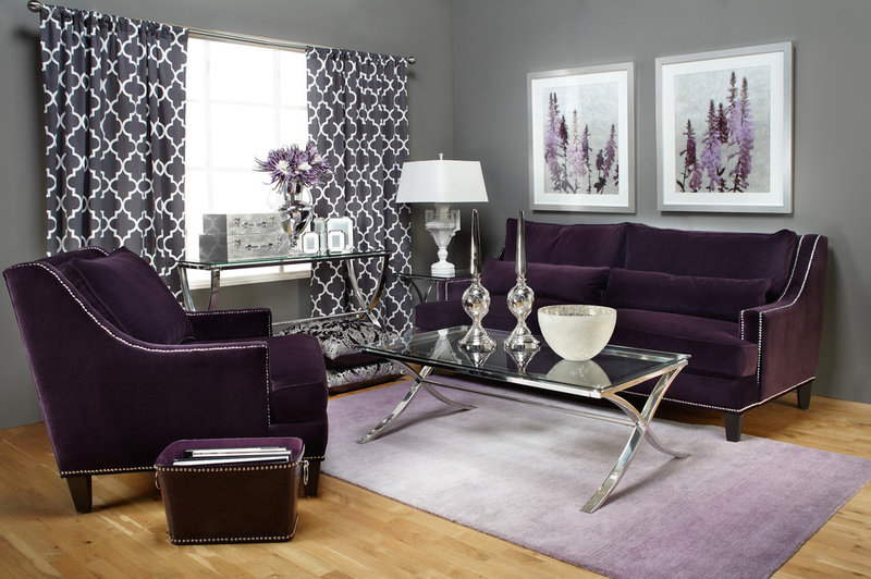
Byzantium is a vibrant
shade of purple that can be confused with fuchsia. While fuchsia is a
bold color derived from pink, byzantium is derived from purple and is
deeper. A natural for sharing the stage, byzantium looks great with
yellow, gray, blue and black.
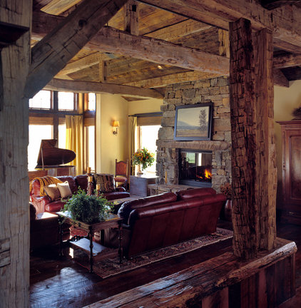
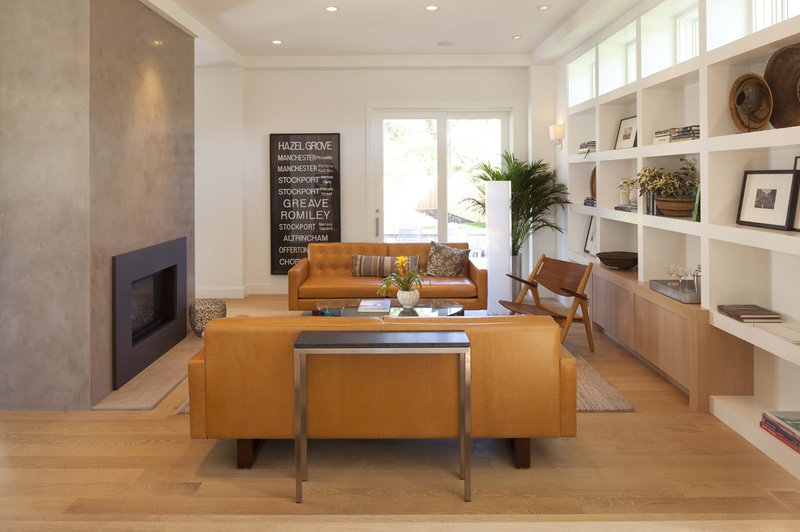
Cordovan is a rich shade of
burgundy/brown, most commonly used to describe leather. These leather
sofas are a perfect example of cordovan. The name originates from the
city of Cordova, Spain, which is known for its production of fine
leather.
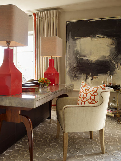
Vermilion is a bright red
to reddish orange. These gorgeous lamps are a classic shade of
vermillion, which is also called Chinese red because it's used in making
Chinese lacquerware.
Sienna is a reddish brown
earth color. The color originates from Siena, Italy, and describes a
clay that consists of iron oxide and manganese oxide.
Gamboge is a deep mustard
yellow. This color gets its name from the gamboge tree, which excretes a
sap that is mustard yellow. This pair of sofas is the perfect shade of
gamboge.
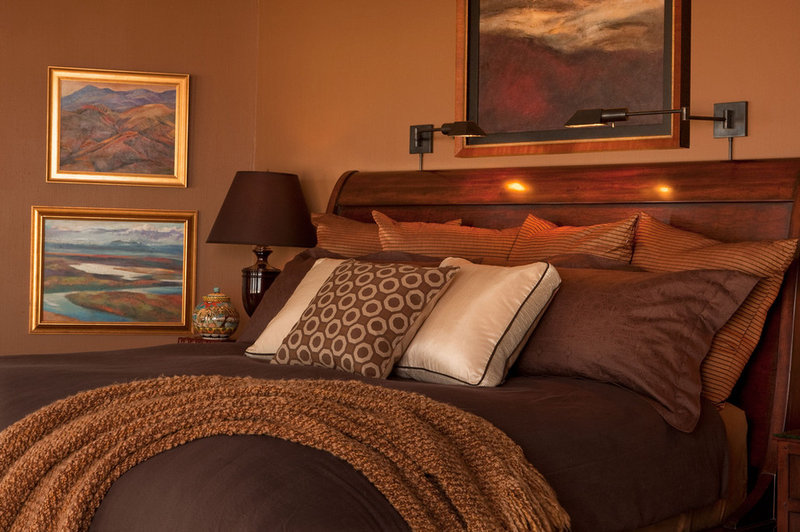
Fulvous is ultimately a
variation of brown but can be described as having yellow undertones,
like these painted walls. Fulvous is inspired by the feathers of ducks
and birds.
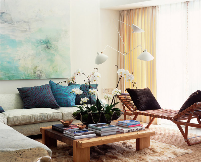
Pavo is an electric blue
that refers to the feathers of a peacock. Best described as between
royal blue and deep turquoise, pavo is seen here in the sofa pillows.
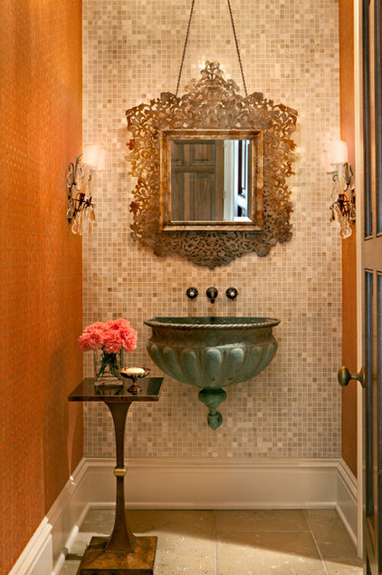
Verdigris is a shade of
green that describes copper when it is exposed to a moisture element.
This vessel sink is a classic verdigris, which has been known to
represent nobility.
Aubergine is a deep brownish purple inspired by the exterior color of an eggplant. I love to see a bold aubergine with gray or turquoise.
Lichen is a murky shade of
gray/yellow green, like in this kitchen wall color. Lichen recently
received attention as Pantone's top color for fall 2013. This mellow
shade of green is inspired by the plant-like fungus that grows in shady
spots especially around tree trunks.
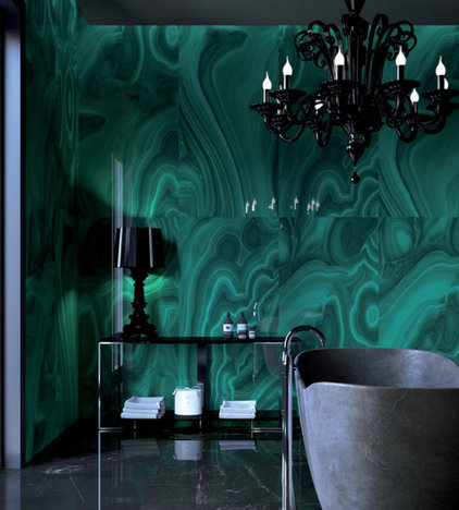
Malachite is a vibrant
green that is very similar to emerald. The main difference is the
undertone of gray, which emerald does not have. Malachite is an earth
color that scientifically is a copper carbonate hydroxide mineral.
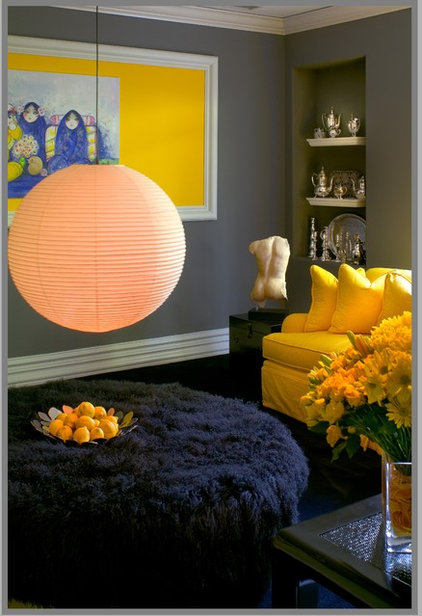
Aureolin is a bright, vivid
yellow that's also sometimes referred to as cobalt yellow. Here is
aureolin in art and flowers. This sassy shade of yellow looks great with
blues and grays.
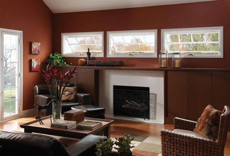
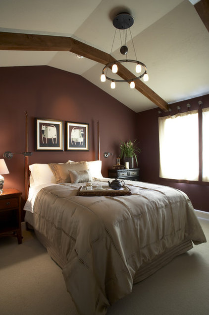
Bole is a brownish-red hue
that really looks like chocolate to me. I think bole, seen here on the
walls, looks great with other neutrals and black.
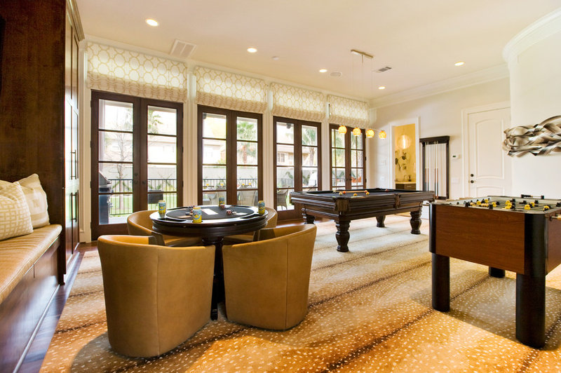
Fallow is a tannish brown
and is inspired by the light brown fur of a deer's back. This gorgeous
shade, selected here for the carpet, pairs well with white and black.
