Muted but complex, these hues from Farrow & Ball can stand on their own or play supporting roles
By Jennifer Ott - Houzz Contributor
Paint and wall covering manufacturer Farrow & Ball has chosen
four key colors for 2014, and they are among my new favorites. Cooking
Apple Green, Stiffkey Blue, Purbeck Stone and Mole’s Breath are all
fairly cool hues that are interesting and attractive without being too
overbearing. These complex colors have a soothing, muted quality, but
they can also easily stand on their own in a room. They work well with
neutrals or can be paired with a whole slew of bold accent hues.
I’ve gathered together images of interiors featuring each paint color as well as suggested palettes to help you work the hues into your own home.
More colors of 2014: Pantone | Benjamin Moore | Sherwin-Williams | PPG Pittsburgh Paints
I’ve gathered together images of interiors featuring each paint color as well as suggested palettes to help you work the hues into your own home.
More colors of 2014: Pantone | Benjamin Moore | Sherwin-Williams | PPG Pittsburgh Paints
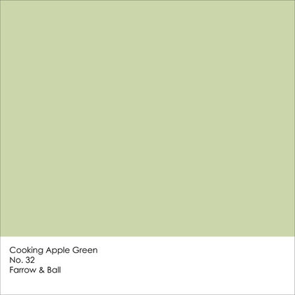
1. Cooking Apple Green
According to Farrow & Ball, Cooking Apple Green is “an uplifting color … is clean and comforting, not challenging in any way, and it creates an uncomplicated haven in which to live.”
This is one of those flexible colors that works well in a variety of spaces — from kitchens and baths to bedrooms and living rooms. It’s also a good choice for an open-concept floor plan, in which you typically want one unifying color that isn’t so assertive that it takes over the entire space.
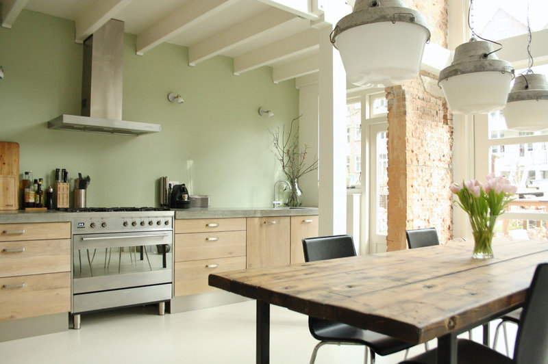
Cooking Apple Green imparts a
fresh and clean vibe when paired with light wood tones and white, as in
this charming kitchen. This room is blessed with plenty of natural
light, but because Cooking Apple Green is fairly light and has a touch
of warming yellow to it, it’s a good choice for a room that doesn’t get
an abundance of natural light too.
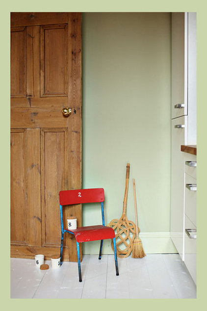
Or use it as a backdrop to
zestier accent colors, such as a bold reddish orange or a vibrant watery
blue. Because of its subdued quality, it won’t clash or compete with
decorative elements that have stronger coloration.
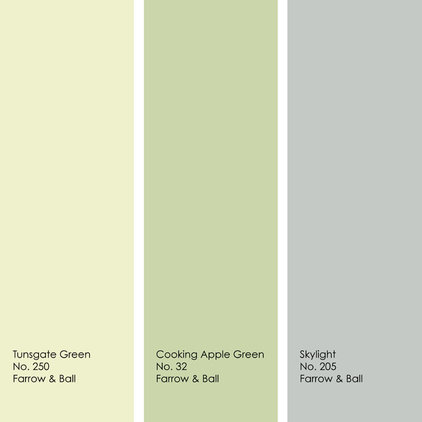
This sample palette is for those
who desire a colorful yet light and soothing space. Any of these three
muted hues would work well as a main wall color, with the other two in
supporting roles as accent colors.
2. Stiffkey Blue
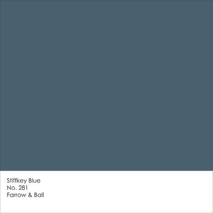
Named for the unusual color of the mud in Stiffkey, a parish along the northern coast of England, this blue has a slight hint of green to it and lots of gray — the latter of which tones down the depth. Stiffkey Blue looks crisp when paired with white, but for added drama you could also pair it with accents of crimson, gold or green.
Named for the unusual color of the mud in Stiffkey, a parish along the northern coast of England, this blue has a slight hint of green to it and lots of gray — the latter of which tones down the depth. Stiffkey Blue looks crisp when paired with white, but for added drama you could also pair it with accents of crimson, gold or green.
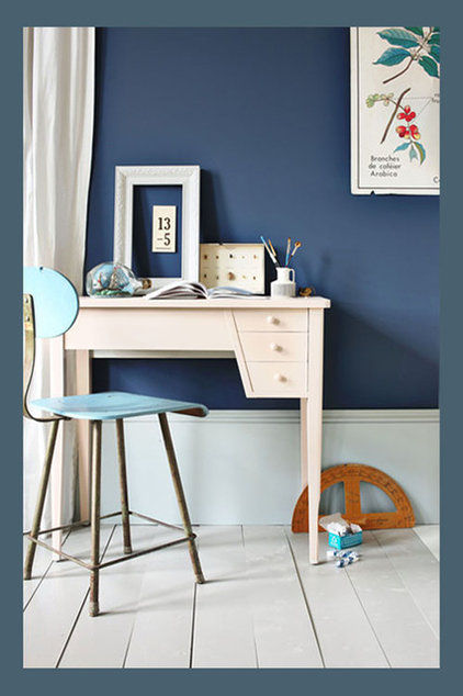
Lighten up this dramatic hue by
combining it with plenty of white. It helps, too, if your space is well
lit. I like the light blue used as small accents here; it’s a nice
transitional color between the dark Stiffkey Blue and the much lighter
shades of white.
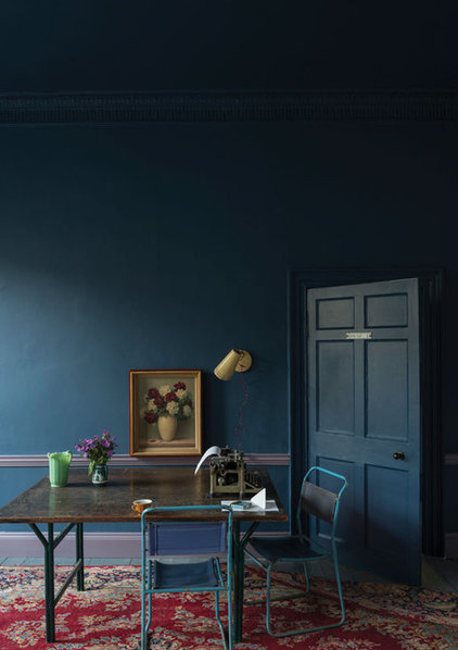
Or play up the drama by working
in dark wood tones and cool red hues. Don’t be afraid to take a chance
on a bold wall color such as this one. But eliminate the guesswork about
whether or not you’re going to like the color in your own space by
painting large samples of potential colors on poster board or spare
pieces of wallboard. You can then move the paint samples around the room
and evaluate them at different times of the day, with the differing
light conditions. By sampling colors first, you’ll avoid committing to a
color until you are sure it’s a winner.
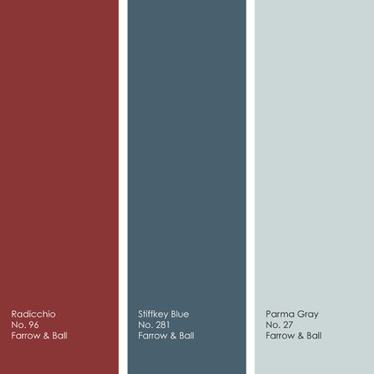
Stiffkey Blue works well with a
variety of hues, including rich reds. But a little bit of Radicchio goes
a long way, so I’d limit it to a single accent wall, or even a partial
accent wall, but inject plenty of Parma Gray and Stiffkey Blue for a
cool, elegant space.
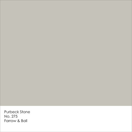
3. Purbeck Stone
This taupe-gray hybrid is the warmest of the four selections. This is my go-to hue for homeowners who seek a departure from white or beige, but want their home to be light and neutral, with a touch of warmth.
This taupe-gray hybrid is the warmest of the four selections. This is my go-to hue for homeowners who seek a departure from white or beige, but want their home to be light and neutral, with a touch of warmth.
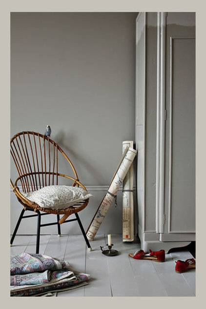
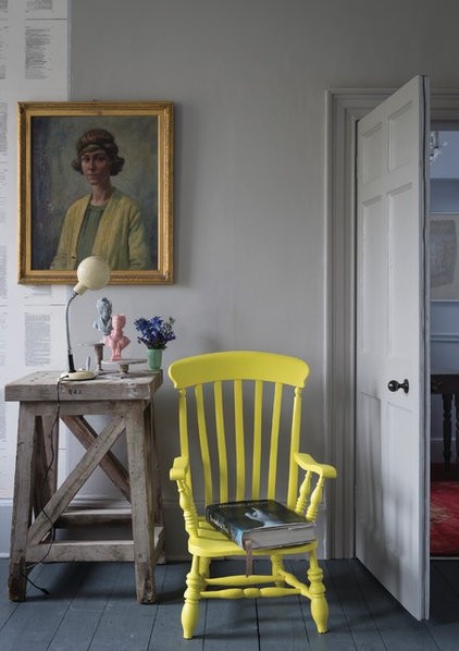
Purbeck Stone has a bit more life to it than white. It feels fresh and modern while being light and soothing.
It’s a terrific background color
to livelier hues. It’s not going to compete for attention with any of
the bold elements you happen to have in the space.
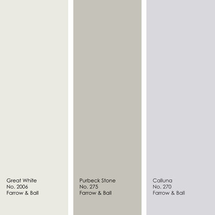
This pretty, muted palette would
work well in a bedroom or office space, or really any room in which you
want to feel relaxed and mellow.
4. Mole’s Breath
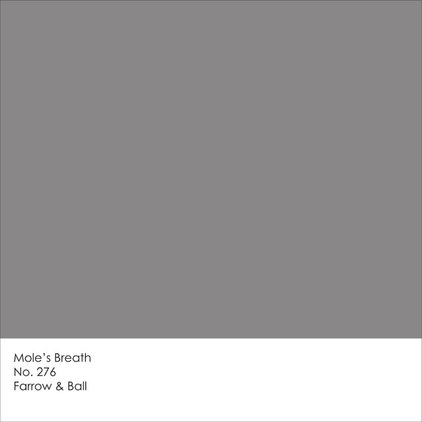
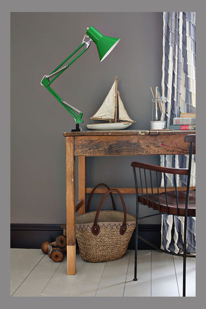
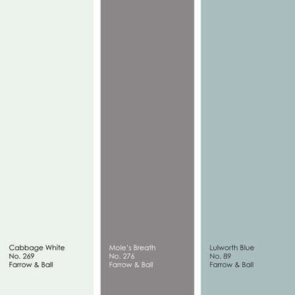
One certainly cannot accuse Farrow & Ball of using dull names for paint colors! This medium-dark gray has a good bit of brown, which gives it warmth and richness. This is another neutral that will work with a variety of other colors. I like it best with watery greens and blues or red-raspberry hues. Or stick with a neutral palette and pair it with with other shades of warm gray as well as white.
One certainly cannot accuse Farrow & Ball of using dull names for paint colors! This medium-dark gray has a good bit of brown, which gives it warmth and richness. This is another neutral that will work with a variety of other colors. I like it best with watery greens and blues or red-raspberry hues. Or stick with a neutral palette and pair it with with other shades of warm gray as well as white.
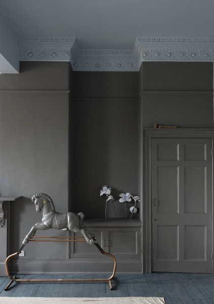
This is a fairly deep hue, so if
you use it in large doses, be sure to consider the quantity and quality
of the light in the space, so the room won’t feel gloomy and cavelike.
I think this color works best in
minimalist spaces that have just a few well-curated decorative elements.
Otherwise it could start to look overworked and much too busy. Or
simply cut back on the amount of the hue in the space, so it won’t
complete with your accessories.
I like playing up the warmth of
Mole’s Breath by pairing it with a contrasting cool blue. If you desire
even more warmth, add wood tones.
Tell us: Which of Farrow & Ball’s four trending hues is your favorite?
More colors of 2014: Pantone | Benjamin Moore | Sherwin-Williams | PPG Pittsburgh Paints
Tell us: Which of Farrow & Ball’s four trending hues is your favorite?
More colors of 2014: Pantone | Benjamin Moore | Sherwin-Williams | PPG Pittsburgh Paints
No comments:
Post a Comment