By Kurt Cyr - Houzz Contributor:
Let’s face it: Most of us are afraid of using pattern of any kind on
large upholstered furniture. I suppose it’s understandable, since
we’ve been told over and over that investment pieces should remain
neutral so it’s easier to change our decor when we want to.
I have one thing to say to that: “They’re not the boss of me!” And they should not be the boss of you, either. Since when did you ever let someone else dictate what you should or shouldn’t do? I say go for bold!
These examples are not for the shrinking violets among us. Rather, they’re here to celebrate the owners’ personalities and inspire confidence. Let’s look at them to understand the power of pattern to make a room really special.
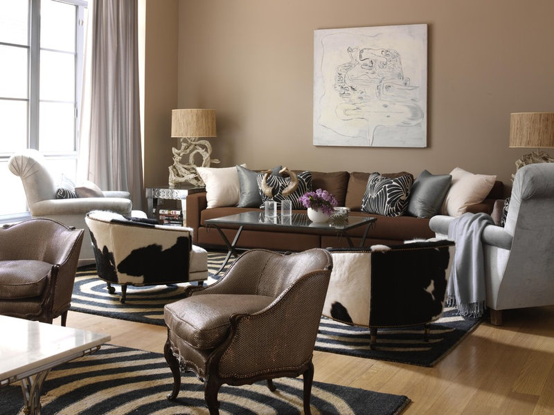
Corral the herd. This pair
of black and white cowhide tub chairs injects a strong sense of the
owner’s humor into a very restrained seating group. Personality is
important to a room’s design, and here we can see the owner’s whimsical
side.
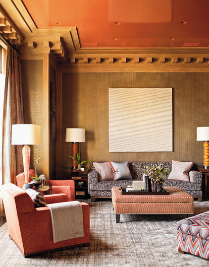
Tipping the scales. The
patterns work here because of the scale of the woven print. The pattern
on the sofa has a subtle texture, while the small print on the chair at
first appears to be a solid color.
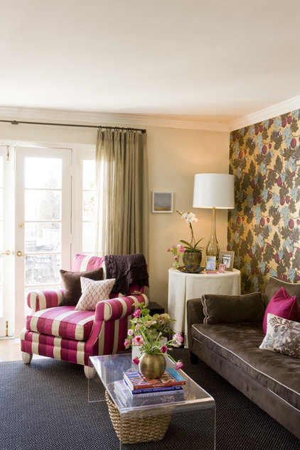
Bold and cheerful. Nobody
puts this baby in the corner! (Figuratively speaking, of course.) Pluck
a color from the wallpaper and run with it — that’s what the designer
did with this bold striped chair. Olive green and fuchsia are
complementary colors, which is why they work so well together here.
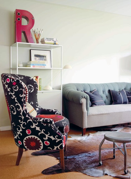
Oh, suzani! Bold
central-Asian suzanis add a worldly touch to chairs and sofas. This is
drama for drama’s sake. An individual piece like this is all a simple
room needs.
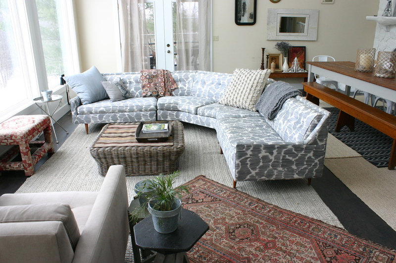
Crocodile tears. This
vintage sectional got a new look with pattern. The large abstract print
is reminiscent of a crocodile pattern. It’s subtle enough to appear to
be a texture, making it a great choice for a long sectional.
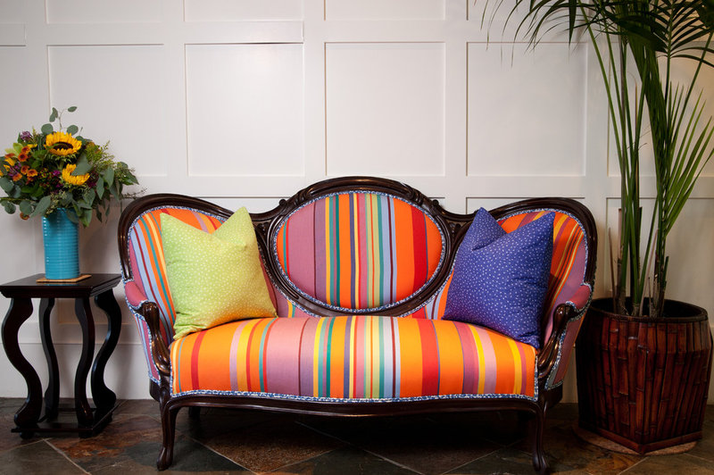
Victorian stripes. This
oval-back Victorian settee has thrown off any illusion of stuffy parlor
games. The unexpectedly vibrant stripes bring it right into the 21st
century, marrying past and present.
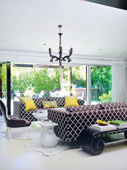
Facing off. This white
space isn’t antiseptic, thanks to the pair of Parsons sofas covered in a
chocolate trellis print. The crisp pattern works especially well with
the severe lines of the sofa. A shock of chartreuse adds unexpected
relief to the high-contrast color palette.
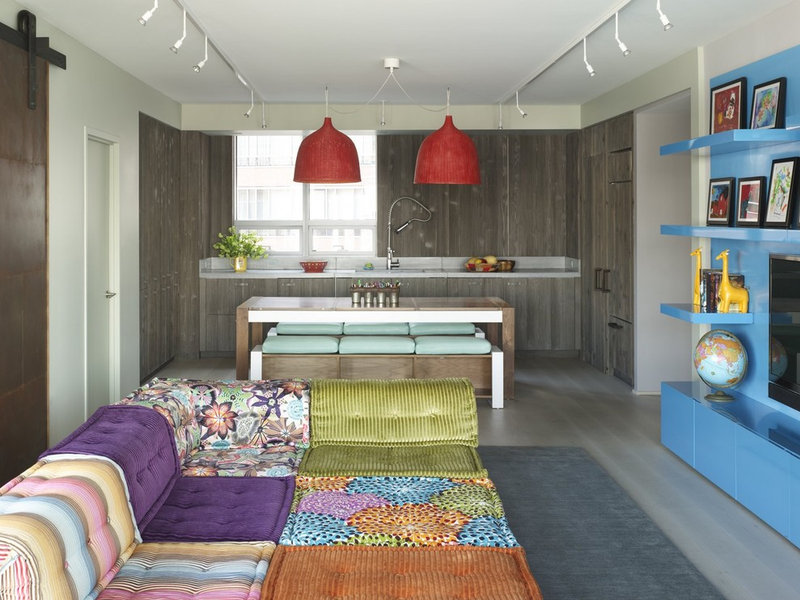
Mix and match. This madcap
sectional isn’t for everyone. There’s a 1960s vibe at work here. The
individual components are treated more like an assortment of pillows
than parts of a large furniture piece, making the whole thing the
perfect lounge for grown-up kids.
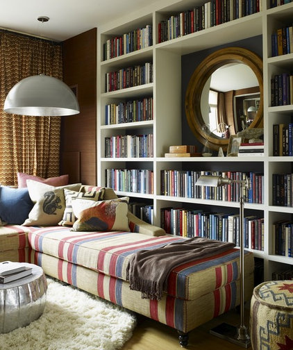
By the book. Here’s a
great way to subtly integrate a bold pattern into a small room. Here
the wide stripes on the upholstery mimic the vertical lines of the books
behind — not only in color, but also in scale.
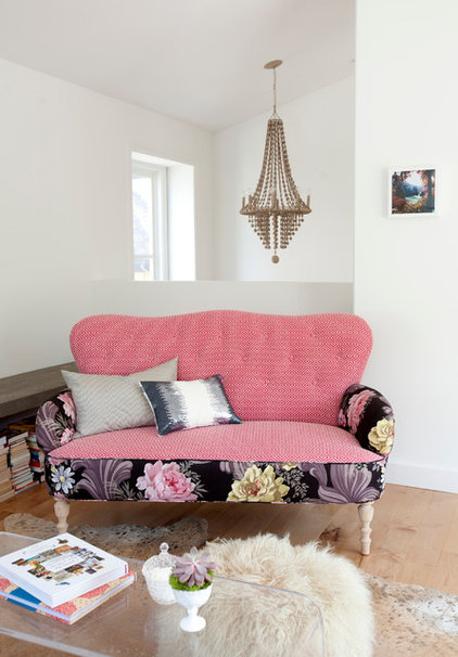
Bohemian rhapsody.
Remnants of vintage floral bark cloth and a small diamond geometric in
red and white give this thrift shop sofa a hippie chic look. This ad
hoc assemblage of patterns isn’t for everyone, but in this spare white
room it’s the showpiece.
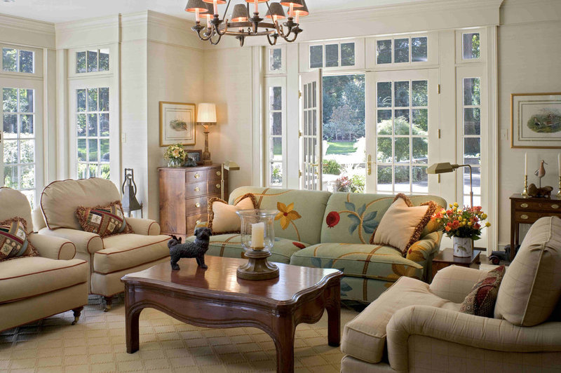
Neotraditional. The large
pattern places the sofa front and center. Although the pattern is very
traditional, its asymmetrical placement is very modern. Unexpected
applications like this are a way to spice up and modernize ho-hum
furniture.
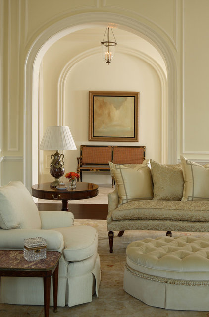
Monochromatic. Pattern can
be used in even the palest, beigest room, if it’s used subtly. This
elegant sofa is upholstered in a bold tone-on-tone damask pattern.
Because damask uses the soft highlights of the weft and warp, it’s a
wonderful choice that doesn’t shout too loudly.
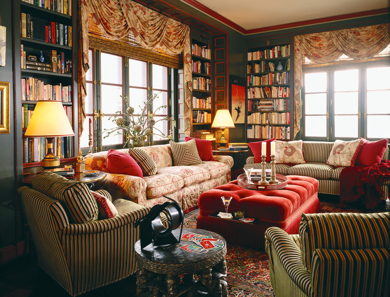
Layering pattern. Stripes
and floral patterns are judiciously used in this library. The ottoman
is the only piece that isn’t patterned. Green and red are complementary
colors, but slightly muddied tones of the two are used to tie all the
patterns together.
No comments:
Post a Comment